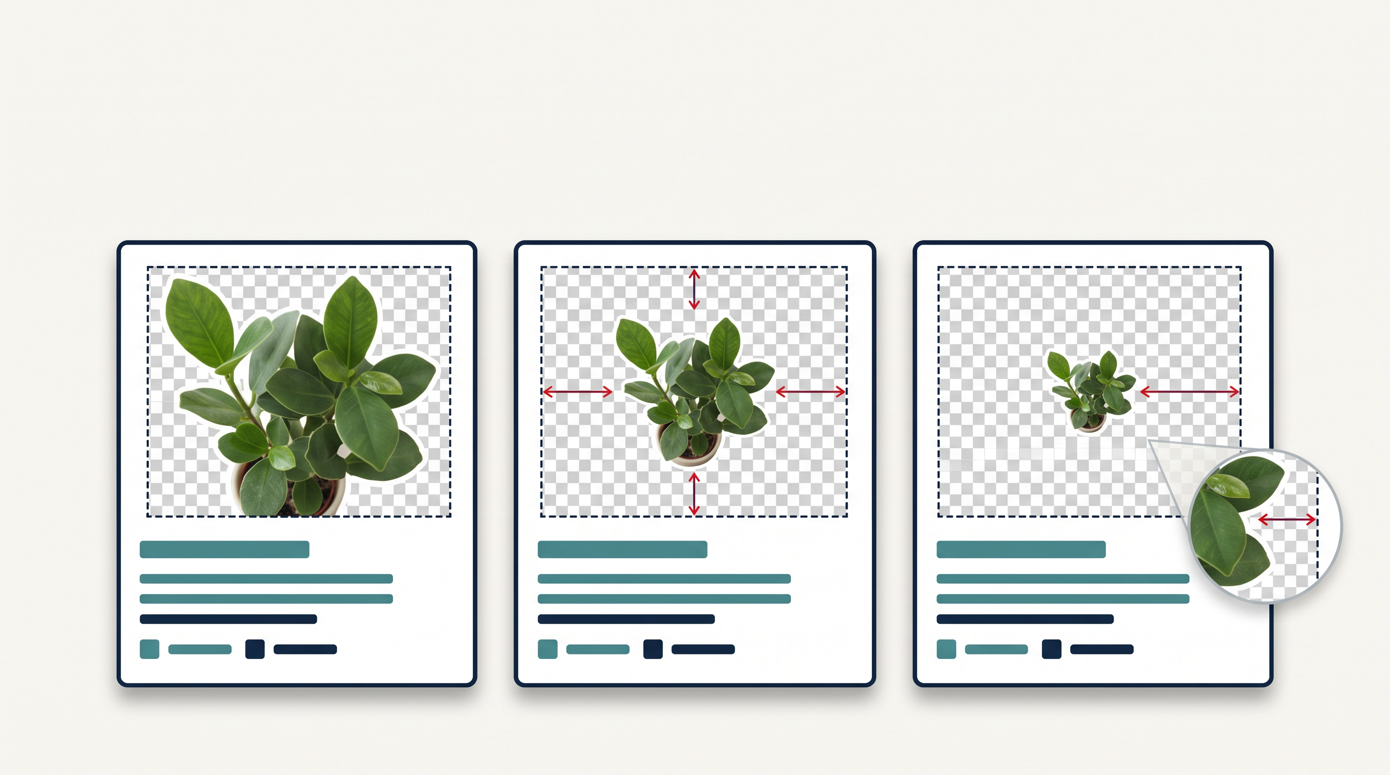
Removing the scene around a subject does not normalize its canvas. Two cutouts with different margins can look wildly different inside otherwise identical UI cards.
Separate asset cleanup from layout
Use a consistent box for your test: one tall subject, one wide subject, and one with generous transparent padding. Keep the intrinsic dimensions in your notes so you can tell an asset issue from a CSS issue.
The remove background from image explainer gives context for the cutout stage. That stage should preserve the subject; it does not decide how the card should size it.
Check what the image box is fitting
With object-fit: contain, the browser fits the image into the box while preserving its aspect ratio. Transparent padding remains part of that image. The MDN object-fit reference explains the sizing behavior.
If the visible subject looks too small, inspect the canvas before changing the component’s dimensions. Cropping unused padding may solve the problem more cleanly than a different CSS rule for every item.
Review the set
Render the cards together at narrow and wide widths. Check for clipped details and inconsistent apparent scale. Keep a source copy before trimming, and document any deliberate margins so a later asset replacement follows the same rule.
Include a visibly off-center asset in the fixture set. If every test image is already neatly trimmed, a layout can pass review while hiding the exact input problem that will appear in production.
Comments
Join the discussionNo comments yet. Be the first to comment.