In modern web development, background removal is frequently delegated entirely to the design or asset-production phase. Designers export a transparent PNG, hand it over, and front-end engineers drop it into an tag.
However, treating cutouts as a visual afterthought introduces hidden technical debt. A transparent asset is not just a graphic; it is a component contract that directly impacts bundle performance, layout stability, theme adaptability, and rendering fidelity across different viewports.
- The Three-Tier Asset Contract in Frontend Architecture To keep codebases clean and scalable, establish a strict three-tier separation for image assets in your repository or asset pipeline:
The Source (.psd, .png master): The uncompressed, high-resolution original file containing full layer data and masks. Never ship this to production.
The Cutout (.png / lossless WebP derivative): The isolated subject with an alpha channel, completely decoupled from any specific background color or context. During rapid prototyping or early component scaffolding, I often rely on a transparent background maker to generate clean alpha masks before integrating assets into the design system repository.
The Rendered Derivative: The final delivery format optimized for specific viewports, DPR (Device Pixel Ratio), and container dimensions.
Separating these tiers ensures that if a design system shifts its branding or card background, engineers don't need to request new photos—they can re-export or re-render the cutout against the new design tokens.
- The Dark Mode Trap: Dealing with Alpha Halos and Matte Fringes One of the most common pitfalls of transparent cutouts is the dark mode fringe effect (halo).
When a graphic is extracted on a white canvas in a design tool, edge pixels are often blended against white. When that same asset is rendered over a #121212 charcoal background in dark mode, an ugly white or gray fringe (halo) appears around the silhouette.
How to mitigate it architecturally: Matte Alignment: Ensure asset generation pipelines export true unassociated alpha channels without baked-in background mattes.
CSS Blend Mode Tweaks: For tricky vector or UI cutout overlays, properties like mix-blend-mode: multiply (on light backgrounds) or screen can sometimes neutralize edge fringing, though clean asset preparation remains the gold standard.
The Theme-Aware Test: Never validate an asset solely on a white canvas. Your CI/CD asset review checklist must mandate testing cutouts against pure white, mid-gray, and deep charcoal (#0a0a0a) backgrounds.
- Delivering Transparent Assets with High Performance ( and Modern Formats) Transparent PNG-24 files can quickly bloat your network payload, especially when dealing with high-resolution photography. Modern web architecture demands modern formats like AVIF and WebP, which support alpha transparency at a fraction of the file size.
Here is how you can structure a robust, responsive, and format-fallback image component using native HTML:
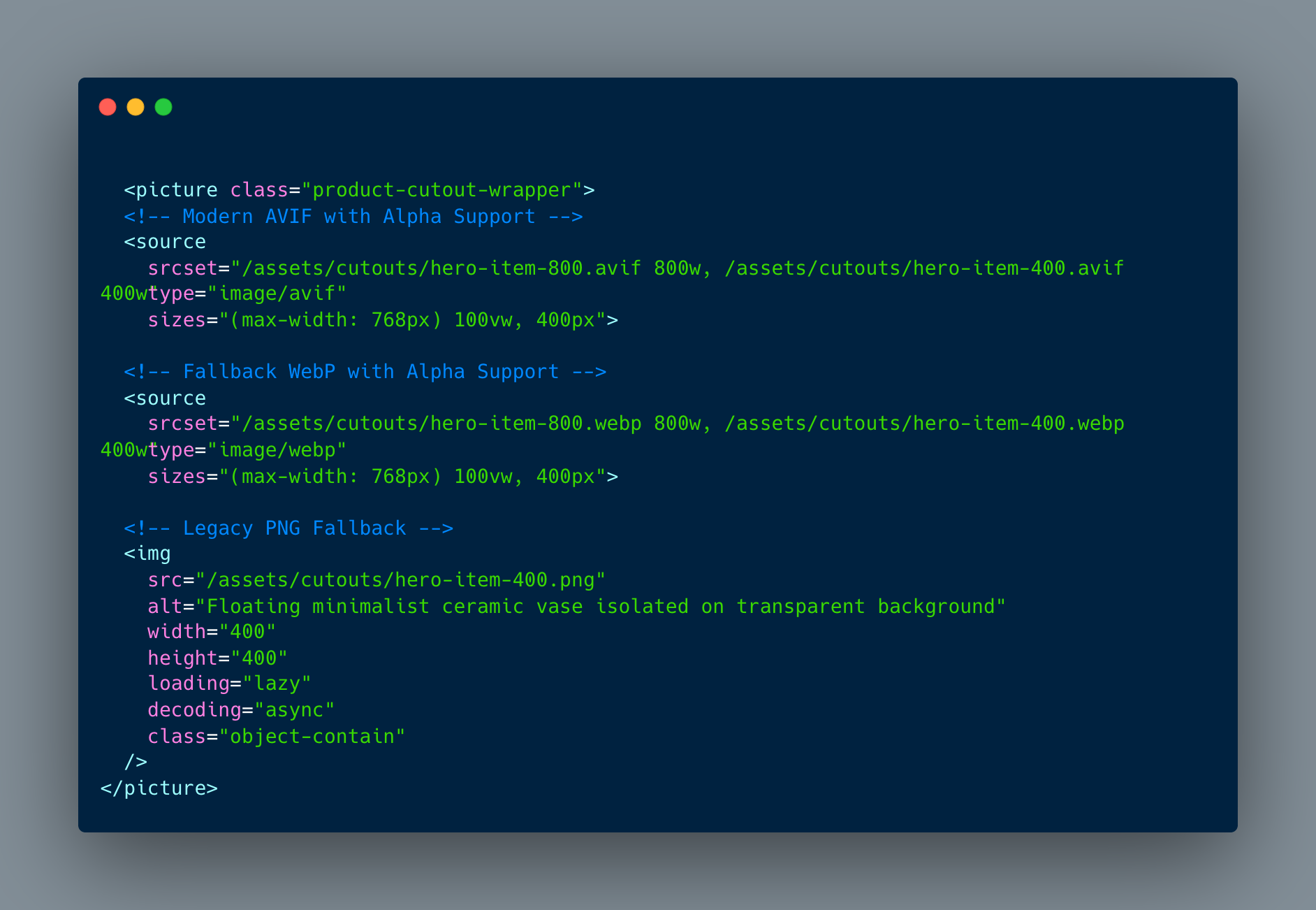
- CSS Resiliency and Layout Stability When working with cutouts inside dynamic card grids, layout shifts (CLS) and scaling bugs are frequent culprits of poor user experience.
Explicit Dimensions: Always declare explicit width and height attributes on the element. Even when overridden by CSS (max-width: 100%; height: auto;), browser rendering engines use these attributes to calculate aspect ratio and reserve paint space before the file downloads.
Object Fitting & Padding: Use object-fit: contain to ensure asymmetrical cutouts never distort within fixed card containers. If shadows or soft edges are clipped by tight boundaries, apply subtle padding (p-4 or equivalent CSS spacing) at the wrapper level rather than baking empty transparent space into the asset file.
- Summary Checklist for Frontend Engineers Before merging a PR that introduces new cutout assets into a component library or design system, run through this quick checklist:
[ ] Format Audit: Are we serving AVIF/WebP with transparent support rather than bloated raw PNGs?
[ ] Theme Stress-Test: Does the asset look clean and free of halos in both light (#ffffff) and dark (#111827) modes?
[ ] CLS Prevention: Are width, height, and responsive sizes attributes correctly specified?
[ ] Accessibility: Is descriptive alt text provided that describes the subject without relying on the word "transparent"?
[ ] Repository Documentation: Are the source asset origin and derivative parameters documented in the component README or asset manifest?
Comments
Join the discussionNo comments yet. Be the first to comment.